Excel for Data Analysis: Complete Beginner's Guide with Functions, PivotTables & Dashboards (2026) | Skill Shikshya
Before Python, before SQL, before Power BI there is Excel. It is the most widely installed data analytic software on earth, available on every corporate laptop in Kathmandu's banking, telecom, and IT sectors, and still the number one tool that hiring managers expect entry-level data analyst in nepal candidates to know cold. This guide covers excel for data analysis from absolute zero from enabling the right tools to building a working data analytics dashboard and explains exactly where Excel fits in the full data analytics roadmap alongside SQL, Python, and Power BI.
Before going deeper into Excel specifically, if you want the broader picture of what is data analytics as a career and discipline, or how data analytics vs data science differ as paths, those guides in our series cover both in full.
What Is Data Analytics? (Data Analytics Meaning & Description)
Data analytics meaning in simple terms: the process of collecting, cleaning, examining, and communicating patterns in data to support business decisions. A data analytics description that captures both the technical and human side: it's the discipline of turning raw numbers into clear answers that help organizations act more intelligently.
Data analytics excel is the entry point to this discipline for most people. Excel makes the core data analytics process import, clean, analyze, visualize, present accessible without any coding knowledge. That's not a compromise. It's a deliberate, practical starting point that transfers directly into every other data analytics tools and platform you'll use afterward.
Why Learn Excel for Data Analytics in 2026?
Before comparing Excel to other data analytic software, it's worth being clear about why it still matters in 2026, even with more powerful tools available:
- Ubiquity Almost every company in Nepal, from a micro-business in Putalisadak to a national bank, has Microsoft Excel. No other analytics tool comes close to this installation base.
- Data analytics required skills alignment Every single data analytics courses curriculum, from free courses to paid programs, includes Excel as a foundational skill. It's listed in most data analyst job in nepal postings.
- Foundation for everything else The logic behind Excel PivotTables maps directly to SQL GROUP BY. Power Query in Excel is built on the same M language engine as Power BI's data transformation layer. Learning Excel deeply means you're already partially learning both SQL and Power BI at the same time.
- Immediate job-readiness A Nepali fresher with strong Excel skills (PivotTables, XLOOKUP, Power Query, dashboard building) can enter roles in finance, operations, NGOs, and business analysis immediately before adding any coding skills.
Setting Up Excel for Data Analysis
How to Enable the Data Analysis ToolPak
The Data Analysis ToolPak is Excel's built-in statistical analysis add-in it adds regression, ANOVA, descriptive statistics, histogram, t-tests, and more. It's installed in Excel but not activated by default, which is why many beginners search "excel data analysis not showing." Here's how to fix it:
For Windows (Excel 2016 and later):
- Go to File → Options → Add-ins
- At the bottom, make sure "Manage: Excel Add-ins" is selected, then click Go
- Tick the box next to Analysis ToolPak and click OK
- A new Data tab option called Data Analysis will now appear on your ribbon
For Mac (Excel 2016 and later):
- Go to Tools → Excel Add-ins
- Tick Analysis ToolPak, click OK
- The Data Analysis button will appear under the Data tab
Still not showing? If you've enabled the ToolPak but excel data analysis not showing in the ribbon, the most common causes are: using Excel Online (the ToolPak is desktop-only), running an older version of Excel that needs updating, or the add-in was disabled by an IT policy on a work machine. In those cases, use Power Query for data cleaning tasks and the built-in statistical functions (AVERAGE, STDEV, CORREL) directly in the worksheet.
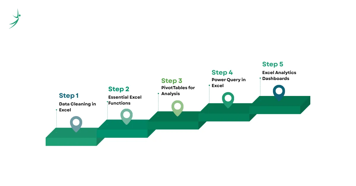
Stage 1: Data Cleaning in Excel The Foundation of Every Analysis
The most underrated skill in excel for data analysis is cleaning. Analysts spend 60–80% of their time preparing data before any real analysis begins. Here are the essential techniques:
Remove Duplicates
Go to Data → Remove Duplicates. Select which columns to check for duplicate values. Excel removes the duplicate rows and tells you how many were deleted. Always work on a copy of your data removing duplicates is irreversible without Undo.
TRIM & CLEAN Functions
Data imported from external systems (ERP, accounting software, web scrapes) often arrives with invisible characters and extra spaces:
=TRIM(A2) → removes all extra spaces, keeps single spaces between words
=CLEAN(A2) → removes non-printable characters (line breaks, special chars)
=TRIM(CLEAN(A2)) → combines both use this as your default cleaning formula
Text to Columns
When a column has combined data (e.g., "Kathmandu, Nepal" in a single cell), go to Data → Text to Columns to split it into separate columns using a delimiter (comma, space, tab) or fixed width.
Flash Fill (Excel's Smartest Cleaning Tool)
Type the pattern you want in the column next to your data, press Ctrl + E, and Excel completes the rest automatically. Flash Fill recognizes patterns from examples extract first names, reformat phone numbers, combine fields with no formula required.
Handling Missing Values (NULLs and Blanks)
Use Go To Special → Blanks (Ctrl + G → Special → Blanks) to select all empty cells at once. You can then fill them with a value, flag them with a formula, or delete rows with critical missing data. For conditional filling:
=IF(A2="", "Unknown", A2)
Stage 2: Essential Excel Functions for Data Analysis
These are the data analytics excel functions that appear in real analytical workflows, not just textbook exercises.
SUMIF, COUNTIF, AVERAGEIF Conditional Aggregation
The most used functions in business data analytics excel work:
=SUMIF(region_range, "Kathmandu", sales_range)
→ Total sales only for the Kathmandu region
=COUNTIF(status_range, "Pending")
→ Count of pending orders
=AVERAGEIF(department_range, "IT", salary_range)
→ Average salary only for the IT department
The SUMIFS, COUNTIFS, and AVERAGEIFS variants accept multiple criteria essential when your analysis involves more than one filter condition simultaneously.
XLOOKUP The Modern Replacement for VLOOKUP
VLOOKUP has well-known limitations: it only searches left-to-right, it breaks when you insert columns, and it returns the first match only. XLOOKUP, available in Excel 2021 and Microsoft 365, fixes all of these:
=XLOOKUP(lookup_value, lookup_array, return_array, [if_not_found])
=XLOOKUP(E2, employee_id_col, salary_col, "Not Found")
→ Finds the salary for any employee ID, works in any direction,
returns "Not Found" instead of the ugly #N/A error
If you're still learning VLOOKUP for a current role, continue it's worth knowing for older files. But invest in XLOOKUP as your primary lookup skill going forward.
INDEX-MATCH The Power User's Lookup
When you need full flexibility (two-way lookups, dynamic column references, or working with very large datasets where XLOOKUP performance matters), INDEX-MATCH is the professional standard:
=INDEX(return_range, MATCH(lookup_value, lookup_range, 0))
=INDEX(C2:C100, MATCH("Ramesh Sharma", A2:A100, 0))
→ Finds Ramesh Sharma's value from column C regardless of column order
Nested IF and IFS Categorization Logic
Categorizing records into segments is a core data analytics process task:
=IFS(
score >= 90, "Excellent",
score >= 75, "Good",
score >= 60, "Average",
TRUE, "Below Average"
)
The IFS function (Excel 2019+) is cleaner than nested IF statements and easier to debug. Use it for customer segmentation, employee performance tiers, and risk classification.
UNIQUE, SORT, FILTER Dynamic Array Functions
Excel's modern dynamic array functions (available in Excel 365 and Excel 2021) behave more like database queries:
=UNIQUE(A2:A100)
→ Returns a list of unique values from the column no manual removal needed
=FILTER(data_range, (region_col="Pokhara")*(status_col="Active"))
→ Returns all rows matching both conditions simultaneously
=SORT(UNIQUE(product_col))
→ Returns sorted unique product names in one formula
These three functions together replace a significant amount of manual pivot table and COUNTIF work for quick data exploration.
CORREL and Statistical Functions
For basic exploratory data analytics:
=CORREL(sales_range, marketing_spend_range)
→ Measures the linear relationship between two variables (-1 to 1)
=STDEV(values_range)
→ Measures how spread out the data is around the average
=PERCENTILE(values_range, 0.9)
→ The value at the 90th percentile useful for outlier analysis
Stage 3: PivotTables Excel's Most Powerful Data Analytics Tool
If there's one skill that distinguishes a beginner Excel user from an analyst, it's PivotTables. A PivotTable lets you summarize, group, filter, and rearrange thousands of rows of data in seconds and update the entire analysis instantly when you add new data.
Creating a PivotTable
- Click anywhere inside your data table
- Go to Insert → PivotTable → New Worksheet
- Drag fields into the four areas:
- Rows what you want to group by (e.g., Region, Month, Product Category)
- Values what you want to calculate (e.g., Sum of Revenue, Count of Orders)
- Columns optional secondary grouping
- Filters top-level filters that apply to the whole PivotTable
Calculated Fields Adding Custom Metrics
Right-click the PivotTable → PivotTable Analyze → Fields, Items & Sets → Calculated Field. This lets you add metrics that don't exist in your raw data:
= Revenue / Units_Sold → Average Selling Price
= (Revenue - Cost) / Revenue → Gross Margin %
Slicers and Timelines Making PivotTables Interactive
Add slicers (Insert → Slicer) to give your PivotTable clickable filter buttons. Add Timelines for date-based filtering by day, month, quarter, or year. These two features are what make a PivotTable report feel like a live, interactive data analytics dashboard rather than a static report.
Refresh and Dynamic Ranges
When your data updates, right-click the PivotTable and select Refresh. To make this automatic, convert your source data to an Excel Table first (Ctrl + T) Excel Tables expand automatically as you add rows, so your PivotTable always captures new data.
Stage 4: Power Query Excel's Hidden Superpower for Data Analytics
Power Query is the most underutilized tool in Excel for serious excel for data analysis work. It automates the data import, cleaning, and transformation process that analysts would otherwise do manually every time new data arrives.
What Power Query Can Do
- Connect to multiple sources Excel files, CSV files, SQL databases, web pages, SharePoint lists, and more
- Automate data cleaning every step you apply in Power Query is recorded as a step that runs automatically when you refresh
- Append and merge tables combine this month's sales data with last month's, or join two tables on a shared key (like SQL JOIN, but visual)
- Unpivot data convert wide, crosstab-format data into clean, row-based tables that PivotTables and Power BI can use
Opening Power Query
Go to Data → Get Data → Launch Power Query Editor. Or use Data → Get Data to connect to a specific source and it will open automatically.
A Real Power Query Workflow
Say you receive monthly sales CSV files from five branches and need to combine them into one report:
- Go to Data → Get Data → From Folder
- Point it to the folder containing all five CSVs
- Power Query shows a preview click Combine & Transform
- Clean each file: remove the header row, standardize column names, filter out blank rows
- Click Close & Load Power Query combines all files into one table in your worksheet
Next month, drop the new CSV into the same folder, click Refresh, and Power Query does everything again automatically. This is the difference between a five-minute refresh and a two-hour manual process.
Stage 5: Building a Data Analytics Dashboard in Excel
A data analytics dashboard in Excel is a single, dynamic view that combines PivotTables, charts, slicers, and KPI cards into one screen that any stakeholder can use to monitor the business. Here's the structure:
Layout and Design Principles
- Use a dedicated Dashboard sheet keep all your raw data and PivotTables on separate sheets
- Fix the zoom level at 100% so the dashboard looks consistent for all viewers
- Use a consistent color palette (2–3 colors maximum, consistent with brand colors)
- Use Cell Styles or named colors rather than manually formatting cells one-by-one
The Four Core Dashboard Elements
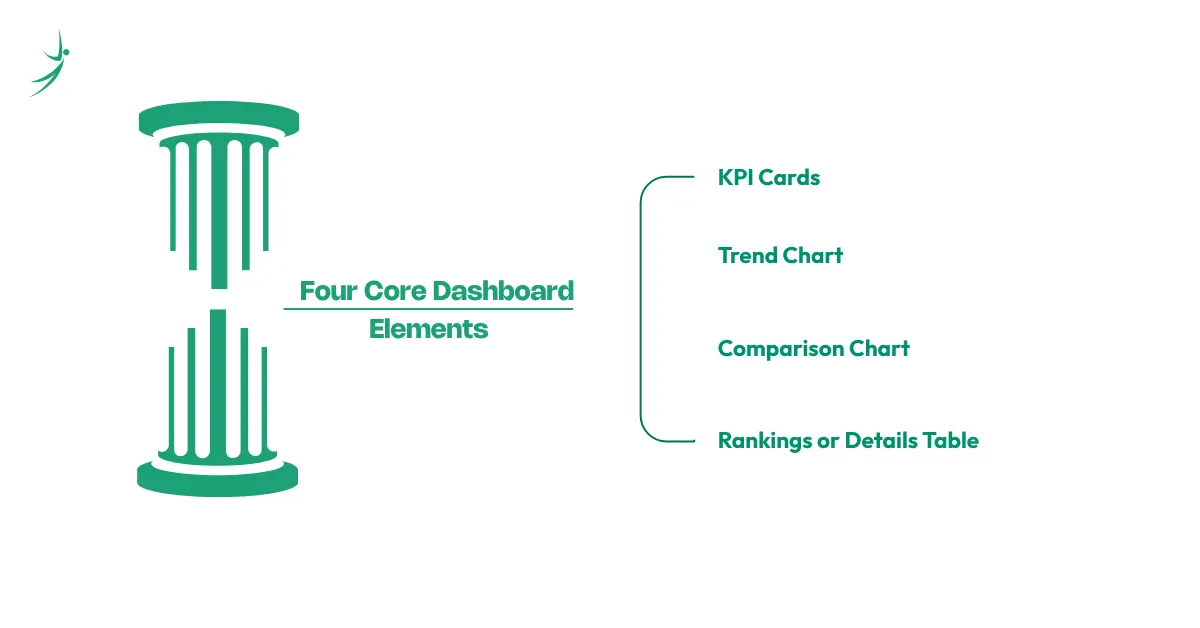
- KPI Cards (Key Metrics at a Glance) Use plain cells with large, bold numbers to show the most critical metrics at the top: Total Revenue, Total Orders, Customer Count, Average Order Value. These update automatically when linked to PivotTable output cells.
- Trend Chart (Performance Over Time) A line chart linked to a date-based PivotTable shows momentum. Connect it to a Timeline slicer so stakeholders can filter to any time period.
- Comparison Chart (Category Breakdown) A bar or column chart linked to a category PivotTable (by region, product, or channel) shows where performance is coming from. Add a slicer so viewers can filter to their own region.
- Rankings or Details Table A small PivotTable showing the top 10 products, customers, or sales reps by value. Format with Data Bars (conditional formatting) to make the ranking immediately visual.
Real Nepal Business Dashboard Example
A Kathmandu-based microfinance institution tracks:
- Total loan disbursements this month vs last month (KPI cards)
- Monthly disbursement trend by quarter (line chart)
- Default rate by branch (bar chart with conditional color formatting)
- Top 10 loan officers by portfolio quality (ranked table)
All of this updates in one click when monthly data arrives. This is the kind of data analytics project that demonstrates real-world Excel skills in a data analyst job in nepal interview.
Excel vs Python for Data Analytics Which Should You Learn First?
Many beginners wonder where python for data analytic work replaces Excel, and where Excel remains the right tool. Here's a clear, honest comparison:
| Factor | Excel for Data Analysis | Python for Data Analytics |
|---|---|---|
| Learning curve | Gentle mouse-driven, visual feedback | Steeper code-based, debugging required |
| Data size limit | ~1 million rows per sheet | No practical limit |
| Automation | Power Query automates refresh; manual steps still needed | Full automation possible with scripts |
| Visualization | Good for standard charts and dashboards | Superior for statistical and custom visualizations |
| Statistical analysis | ToolPak covers basics | Full statistical library (scipy, statsmodels) |
| Sharing output | Excel files, PDF exports | Scripts, notebooks, web apps |
| Job market demand in Nepal | Very high (required for most entry-level roles) | High (required for mid-to-senior roles) |
| Best for | Data cleaning, dashboards, reporting, business analysis | Automation, large datasets, predictive modeling, ML |
The answer for a beginner: Excel first, Python second. Excel teaches you the logic of data manipulation (which maps directly to Python's pandas library), gives you immediate job-relevant skills, and remains the primary tool in most Nepali analytical workflows. Python for data analytic work extends what you can do with Excel, it doesn't replace it. Our dedicated python for data analytics guide covers when and how to make that transition.
AI in Data Analytics: How Excel Uses AI Now
AI in data analytics is not a future capability it's already built into Excel for Microsoft 365 users, and it's changing how analysts work with the tool.
AI Data Analysis Excel: Excel Copilot
Microsoft Copilot for Excel (available in Microsoft 365 Business and Enterprise plans) lets you type natural language requests into the sidebar and have AI perform the analysis:
- "Summarize the top trends in this dataset"
- "Create a PivotTable showing revenue by region and quarter"
- "Highlight the rows where profit margin is below 10%"
- "Add a column that classifies each customer as High/Medium/Low value based on their total purchases"
Copilot generates formulas, builds PivotTables, adds conditional formatting, and writes Power Query steps all from plain English instructions. This doesn't replace knowing Excel; it makes knowing Excel more powerful, because you still need to understand what Copilot produces to verify it's correct.
Analyze Data (Ideas) Feature
For users without Copilot, Excel's built-in Analyze Data button (Home tab → Analyze Data) uses AI to automatically suggest PivotTables, charts, and patterns in your selected data. It's a good starting point for exploratory analysis when you're not sure what questions to ask.
AI ML in Data Analytics: Where Excel Ends and Python Begins
AI ML in data analytics workflows that go beyond summary statistics and dashboards predictive models, classification, clustering, anomaly detection require Python and its machine learning libraries (scikit-learn, TensorFlow, PyTorch). Excel's ToolPak and Copilot cover descriptive and some inferential analytics well, but ai data science machine learning applications that run on large datasets and require model training live in Python.
This is why the progression in our Business Data Analytics with AI course goes: Excel → SQL → Power BI → Python → AI-powered analytics tools. Each layer builds on the one before it.
Understanding AI in data analytics as a broader trend how AI is changing analyst roles, what ai data science subjects are becoming table stakes, and how to position yourself for AI-augmented analytics roles is covered in full in our dedicated AI in data analytics guide.
Data Analytics Required Skills: Excel's Role in the Full Stack
When employers list data analytics required skills in job postings in Nepal, they typically expect:
| Skill Category | Tools | Excel Connection |
|---|---|---|
| Data manipulation | Excel, SQL, Python (pandas) | Excel teaches the logic; SQL and pandas extend the scale |
| Visualization | Excel, Power BI, Tableau | Excel dashboards are the entry point; Power BI scales them |
| Statistical analysis | Excel ToolPak, Python (scipy), R | Excel ToolPak covers descriptive stats and basic inference |
| Data cleaning | Excel (Power Query), Python | Power Query is directly transferable to Power BI's data layer |
| Business communication | Excel (dashboards, reports) | Excel output is what most stakeholders consume |
| AI tools | Copilot, Python, AI platforms | Copilot in Excel introduces AI-assisted analysis at the tool level |
Excel is not one skill among many in this list it's the foundation that makes every other skill on it more accessible.
Data Analytics Roadmap: Where Excel Fits
The complete data analyst roadmap for a Nepal-based beginner, with Excel's stage clearly marked:
- Stage 1 Excel & Data Foundations ← This post covers this Excel for data cleaning, PivotTables, Power Query, dashboard building, and basic statistical functions. This is the starting point for every data analytics for beginners path.
- Stage 2 SQL for Data Querying Moving data work from Excel files into databases essential when data grows beyond what Excel can handle and when working with company systems. Our SQL for data analytics guide covers this in full.
- Stage 3 Power BI for Professional Dashboards Taking Excel's dashboard logic into a tool built specifically for enterprise reporting, with live data connections and automatic refresh. Our Power BI for beginners guide covers this as the next natural step after Excel.
- Stage 4 Python for Analytics & Automation Handling datasets too large for Excel, building predictive models, and automating repetitive analytical workflows. Python builds on the same manipulation logic Excel teaches GROUP BY is groupby(), VLOOKUP is merge(), PivotTable is pivot_table().
- Stage 5 AI-Powered Analytics Integrating AI tools Copilot, LLM-assisted analysis, machine learning outputs into standard analytics workflows. Ai data science subjects at this level include prompt engineering for data analysis, AI-assisted insight generation, and building data pipelines that integrate model outputs with BI dashboards.
Data Analytics Salary in Nepal: What Excel Skills Are Worth
Salary ranges verified against Kumarijob, NecoJobs, Paylab, and live job postings (mid-2026):
| Role | Experience | Monthly Salary (NPR) | Primary Excel Skills Required |
|---|---|---|---|
| Data Analytics Intern | 0 years | 10,000–25,000 | Basic formulas, sorting, filtering, basic charts |
| Entry-level Data Analyst | 0–1 years | 30,000–60,000 | PivotTables, VLOOKUP/XLOOKUP, dashboard basics |
| Mid-level Data Analyst | 1–3 years | 60,000–100,000 | Power Query, complex formulas, dynamic dashboards |
| Senior Data Analyst | 3–5 years | 100,000–150,000+ | Full Excel + SQL + Power BI stack |
| AI Data Analyst Salary (AI-specialized roles) | 3+ years | 120,000–200,000+ | Excel + Python + AI tools integration |
The ai data analyst salary premium in Nepal is real and growing: roles that explicitly require AI-integrated analytics (Copilot proficiency, Python + ML for data analysis, AI-assisted reporting) consistently command 30–50% more than equivalent traditional analyst roles. This gap is expected to widen through 2027 as AI tools become standard in enterprise analytics workflows.
For remote roles: Nepali analysts with strong Excel, SQL, and Power BI portfolios applying for international data analytics remote jobs can target USD 500–1,500/month, while those with Python and AI tools integration can target USD 1,500–3,000/month in fully remote analytical roles.
Data Analytics Projects Using Excel: Build Your Portfolio
The gap between knowing Excel and being hireable is a portfolio. Here are data analytics project ideas that demonstrate real skills in an interview:
Beginner Projects:
- Sales performance dashboard (monthly revenue by product and region, trend chart, top 10 customers) uses PivotTables, slicers, KPI cards
- HR attendance and leave tracker with automated summary (COUNTIFS, conditional formatting, monthly summary pivot)
Intermediate Projects:
- Customer purchase analysis with segmentation (RFM scoring Recency, Frequency, Monetary using formulas and PivotTables)
- Financial variance analysis (budget vs actual by department and month, with waterfall chart)
- NGO program monitoring dashboard (beneficiary tracking, output vs target, geographic breakdown by district)
Advanced Projects:
- Multi-source data consolidation with Power Query (combining data from five branch offices into one automated monthly report)
- Sales forecasting using Excel's FORECAST.ETS function (exponential smoothing) combined with a trend chart and ToolPak regression
These are the kinds of projects that turn an excel course for data analysis into a credential an employer can verify not just a certificate, but evidence of capability.
Data Analytics Courses in Nepal: Excel as Your Starting Point
Whether you're looking for an excel for data analysis full course, exploring data analytics free courses, or ready for structured data analytics training, here's how to evaluate your options:
Data analytics free courses worth starting with:
- Microsoft's free Excel training (support.microsoft.com/training) official, comprehensive, free
- GCFLearnFree Excel beginner-friendly, visual, no account neededCoursera Excel Basics for Data Analysis by IBM free to audit, covers PivotTables and Power Query
- Coursera Excel Basics for Data Analysis by IBM free to audit, covers PivotTables and Power Query
- YouTube channels (Excel Campus, Leila Gharani, MyOnlineTrainingHub) the best free Excel tutorial content available in English
Where data analytics best courses and structured training add value beyond free resources:
- Real, messy business datasets (not clean tutorial files)
- Step-by-step portfolio project guidance with mentor feedback
- Nepal-specific business case studies and job market context
- SQL, Power BI, and Python taught in sequence after Excel, so you leave with the full stack
If you're searching for a data analytics full course that starts with Excel and builds through SQL, Power BI, Python, and AI tools rather than treating Excel in isolation Skill Shikshya's Business Data Analytics with AI course in Nepal is built around exactly that progression. It's designed for both students with no prior background and working professionals upgrading their analytics toolkit, with a data analytics course in nepal curriculum that matches what Kathmandu's IT, banking, and NGO sectors actually require.
For the broader landscape of business analytics in nepal how different data analytics courses online compare, what data analytics institute options exist, and what certifications hold value with Nepali employers our career guide to becoming a data analyst covers all of it as part of the full roadmap.
Frequently Asked Questions
Why does the Data Analysis option not show in Excel?
What is data analytics meaning?
What is the data analytics process in Excel?
Is VLOOKUP still worth learning?
What data analytics tools should I learn after Excel?
What is the data analytics salary for Excel-skilled analysts in Nepal?
What is the difference between Excel and Power BI for data analytics?
What is a data analytics dashboard in Excel?
About Author:

Mr. Saurav Raj Joshi is a skilled Data and BI Engineer at Fusemachines, specializing in SQL and the Azure ecosystem, including Fabric, Azure Data Factory, and Synapse Analytics. He focuses on building efficient ETL pipelines, upgrading legacy systems, and ensuring data integrity to support informed business decisions.
Mr. Joshi is also adept at translating complex technical concepts into clear insights and creating effective data visualizations that drive operational efficiency and business growth.