Tableau for Beginners: A Complete Beginner's Guide to Tableau (2026) | Skill Shikshya
If you've spent any time researching data analytics tools, you've seen Tableau mentioned alongside Power BI as one of the two dominant platforms for turning data into visual stories. But for most beginners in Nepal, Tableau feels intimidating no clear starting point, no free option that's obvious, and no guide that connects the tool to a real data analyst job in nepal career path. This is that guide.
This tableau beginner guide covers everything from the very first step which version to download and whether tableau for beginners free options are genuine through the interface, chart types, dashboards, and how Tableau fits your full data analytics roadmap. No prior analytics tool experience required.
If you haven't yet read what is data analytics as a discipline, or our data analytics vs data science guide, those cover the broader context of where Tableau sits as a career tool before you go deep on any one platform.
What Is Tableau?
Tableau is a visual analytics platform that connects to data sources and lets you build interactive charts, dashboards, and stories without writing code. It was founded in 2003 as a Stanford University research project, released commercially in 2004, and acquired by Salesforce in 2019. As of 2026, it remains one of the two most widely used business intelligence (BI) platforms globally alongside Microsoft Power BI.
Data analytics meaning in the context of Tableau: the tool sits at the visualization and communication end of the data analytics process after data has been collected, cleaned, and analyzed (typically in SQL, Python, or Excel), Tableau turns those results into interactive dashboards that anyone in an organization can explore without needing technical skills.
What makes Tableau genuinely distinctive as a piece of data analytic software:
- VizQL (Visual Query Language) a proprietary engine that translates drag-and-drop interface actions into database queries automatically, making data exploration extremely fast
- Speed of analysis Tableau is built for rapid, exploratory visualization; it's faster to build and iterate charts in Tableau than almost any other tool
- Design quality Tableau produces better-looking, more polished visualizations by default than Excel or Power BI, which is why it's dominant in marketing, consulting, and design-sensitive analytics roles
- Storytelling Tableau's "Stories" feature lets analysts sequence dashboards into a narrative presentation, not just a collection of charts
Tableau Products: Which One Should a Beginner Use?
Tableau isn't a single product it's a product family. Before you download anything, here's what each product actually is:
| Product | What It Does | Price | Who It's For |
|---|---|---|---|
| Tableau Public | Build and publish visualizations online; fully free, but all work is public | Free | Students, beginners, portfolio building |
| Tableau Desktop | Full-featured local application; connects to any data source | ~$42/user/month (Creator license) | Professional analysts |
| Tableau Server | Host Tableau dashboards internally within an organization's own servers | Enterprise pricing | IT-managed organizations |
| Tableau Cloud (formerly Online) | Salesforce-hosted version of Tableau Server | Per-user pricing | Teams without on-premise server infrastructure |
| Tableau Prep Builder | Visual data cleaning and transformation pipeline tool | Included in Creator license | Analysts handling messy, multi-source data |
For any beginner, the answer is unambiguous: start with Tableau Public. It is fully free, has no meaningful feature restrictions for learning, and is how most professional analysts built their first portfolio of Tableau work.
Tableau for Beginners Free: Tableau Public The Complete Setup Guide
Tableau for beginners free means Tableau Public, and the setup takes under five minutes.
Step 1: Download Tableau Public Go to public.tableau.com and click "Download Tableau Public." The installer is available for Windows and macOS unlike Power BI Desktop, Tableau works natively on both operating systems.
System requirements (2026):
- Windows: Windows 10 or later (64-bit)
- macOS: macOS 13 (Ventura) or later
- RAM: minimum 8 GB (16 GB recommended for larger datasets)
- Storage: 1.5 GB minimum
Step 2: Create a Tableau Public Account You'll need a free Tableau Public account to save and publish your work. Sign up at public.tableau.com it takes two minutes, requires only an email address, and is completely free.
Step 3: Open Tableau Public Desktop After installation, opening Tableau Public shows the Start Page: a "Connect" panel on the left (where you bring in data), a "Discover" section in the center (featured public vizzes for inspiration), and a "Open" section on the right (recent work).
What Tableau Public can do (vs what it can't):
Can do: Connect to Excel, CSV, Google Sheets, JSON, PDF, statistical files, and spatial data. Build any chart type. Create multi-view dashboards. Build Stories. Use Tableau's full calculation and LOD engine. Publish to your public profile.
Cannot do: Connect to live databases (SQL Server, MySQL, PostgreSQL these require Tableau Desktop). Save work locally as a private file (all published vizzes are publicly visible on your Tableau Public profile). Access data from Salesforce, SharePoint, or enterprise connectors.
For a beginner building a portfolio, Tableau Public's public profile is actually an advantage: your work is visible to recruiters and hiring managers, making every dashboard you build a portfolio asset without any extra sharing step.
Tableau Beginner Tutorial: The Interface Walkthrough
Once you've opened Tableau Public and connected to a dataset, here's what you're looking at and what every element does.
The Data Source Page
The first screen after connecting to data. It shows a preview of your data table, lets you join multiple tables, and allows basic data type changes. Confirm your column types are correct here (numbers showing as strings is the most common issue) before moving to the sheet.
The Worksheet: Tableau's Core Working Environment
The worksheet is where every visualization is built. Its key elements:
Dimensions vs Measures (the most important concept in Tableau) Tableau automatically categorizes every column in your data as either a Dimension or a Measure:
- Dimensions are categorical fields things you group or segment by (Region, Product Name, Month, Employee Name). They appear in blue pills.
- Measures are numerical fields things you calculate and aggregate (Revenue, Units Sold, Profit, Count). They appear in green pills.
Understanding this distinction is the single most important conceptual step for any tableau for beginners journey. Almost every visualization issue beginners encounter comes from confusing a dimension and a measure.
Shelves and Cards
- Rows and Columns shelves dragging fields here controls what appears on each axis of your chart
- Marks card controls Color, Size, Label, Detail, and Tooltip for your visualization
- Filters shelf controls what data is included in the view
- Pages shelf creates an animated "page-through" effect, useful for time-series data
Show Me Panel The "Show Me" button (top right) suggests appropriate chart types based on what you've dragged onto the canvas. It's a useful guide when you're starting and not sure which chart fits your data, though you'll rely on it less as your instinct develops.
Creating Your First Visualization: Step-by-Step
Here's a concrete tableau beginner tutorial walkthrough using the Superstore sample dataset (included with every Tableau installation):
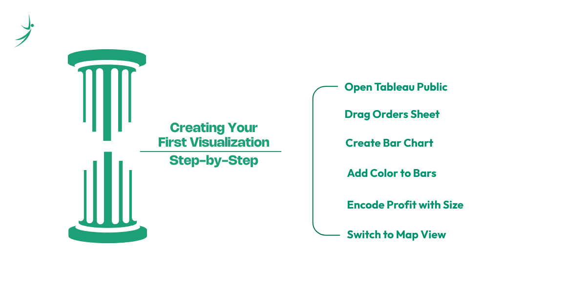
- Step 1: Open Tableau Public and connect to the Superstore Excel file (comes pre-installed in Tableau's Documents/My Tableau Repository/Datasources folder).
- Step 2: Drag the "Orders" sheet onto the canvas in the Data Source view, then click "Sheet 1" at the bottom to open the worksheet.
- Step 3: Drag "Region" from the Dimensions list to the Rows shelf. Drag "Sales" from the Measures list to the Columns shelf. Tableau immediately creates a horizontal bar chart showing total sales by region.
- Step 4: Drag "Category" to the Color card in the Marks panel. The bars split into colored segments showing sales contribution by product category within each region.
- Step 5: Drag "Profit" to the Size card. The bars now encode profit margin as thickness regions and categories with higher profits show thicker segments.
- Step 6: Click "Show Me" and select the map icon. Tableau switches to a geographic view showing sales by state, automatically recognizing geographic fields in the data.
That entire sequence from raw data to four different meaningful views takes under three minutes in Tableau. This speed of exploration is what the tableau beginner guide experience is really about.
Chart Types in Tableau: When to Use What
Tableau supports more than 30 chart types through its Show Me panel plus custom combinations. For tableau for beginners, mastering these eight covers 90% of real business analytics work:
| Chart Type | When to Use It | Tableau Shortcut |
|---|---|---|
| Bar Chart | Comparing values across categories | Drag dimension to Rows, measure to Columns |
| Line Chart | Showing trends over time | Drag date to Columns, measure to Rows |
| Scatter Plot | Showing correlation between two measures | Two measures on Rows and Columns respectively |
| Map | Geographic distribution of data | Drag a geographic field (State, Country) to the canvas |
| Treemap | Showing part-to-whole with many categories | Two dimensions + one measure → Show Me → Treemap |
| Heatmap | Showing intensity across two dimensions | Two dimensions + one measure → Show Me → Heatmap |
| Bullet Chart | Showing actual vs target (KPI tracking) | Reference line + bar chart |
| Waterfall Chart | Showing cumulative change (revenue bridges) | Running total quick table calculation + bar chart |
Chart selection rule for beginners: let the question drive the chart type, not the other way around. "What's trending over time?" → line chart. "Which category is biggest?" → bar chart. "Where are our customers?" → map. Starting from the business question always produces a more useful visualization than starting from an interesting chart type.
Tableau Calculations: Calculated Fields and LOD Expressions
Calculated Fields Adding Metrics Your Data Doesn't Have
Tableau's calculated fields let you create new measures and dimensions using a formula language similar to Excel. Right-click the empty space in the Measures section → "Create Calculated Field":
// Profit Margin %
[Profit] / [Sales]
→ Format as percentage in the formatting pane
// Year-over-Year Sales Growth
(SUM([Sales]) - LOOKUP(SUM([Sales]), -1)) / ABS(LOOKUP(SUM([Sales]), -1))
→ Requires table calculation; shows % change vs prior year
// Customer Segment Classification
IF [Sales] >= 100000 THEN "High Value"
ELSEIF [Sales] >= 50000 THEN "Medium Value"
ELSE "Standard"
END
LOD Expressions The Most Powerful Tool in Tableau
LOD (Level of Detail) expressions are Tableau's equivalent of SQL window functions they let you compute aggregations at a different grain than the current view. They're considered advanced, but the concept is simpler than it sounds:
// Fixed LOD: Customer's total lifetime spend, regardless of how the view is filtered
{ FIXED [Customer ID] : SUM([Sales]) }
// Include LOD: Add a dimension to the calculation that isn't in the current view
{ INCLUDE [Region] : AVG([Sales]) }
// Exclude LOD: Remove a dimension from the calculation
{ EXCLUDE [Category] : SUM([Profit]) }
A practical example: you want to show each order's value as a percentage of that customer's total lifetime spend. Without LOD expressions this requires a separate data preparation step. With a FIXED LOD, Tableau computes the customer total and uses it directly in the ratio, even if your view is showing individual order rows.
Building a Data Analytics Dashboard in Tableau
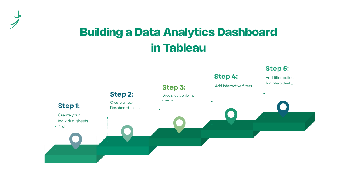
A data analytics dashboard in Tableau brings multiple worksheets together into a single, interactive view. Here's how to build one that actually works:
- Step 1: Create your individual sheets first. Build each visualization you want on the dashboard as its own worksheet sales trend, regional breakdown, top products, KPI metrics. Each should be clean, titled, and fully functional before you combine them.
- Step 2: Create a new Dashboard sheet. Click the "New Dashboard" icon at the bottom (next to the sheet tabs). Set your dashboard size "Automatic" adapts to the viewer's screen; a fixed size (e.g., 1200 x 800px) gives more layout control.
- Step 3: Drag sheets onto the canvas. Sheets from your workbook appear in the left panel. Drag them onto the dashboard canvas. Tableau uses a tiled layout by default sheets snap into position relative to each other.
- Step 4: Add interactive filters. Click any chart on the dashboard, then click the filter icon that appears in the top-right corner of the selected object. This makes that chart's filter apply to all connected sheets click "Apply to Worksheets → All Using This Data Source" for cross-dashboard filtering.
- Step 5: Add filter actions for interactivity. Go to Dashboard → Actions → Add Action → Filter. Set a source sheet (the one the user clicks) and target sheets (the ones that respond). Now clicking a bar in one chart filters every other chart on the dashboard simultaneously this is what makes Tableau dashboards feel alive compared to static reports.
Nepal Business Dashboard Example Sales Operations: A consumer goods distributor in Kathmandu builds a Tableau dashboard showing:
- Monthly revenue by district (map visual)
- Top 10 SKUs by sales volume (bar chart)
- Year-over-year growth by category (line chart)
- Return rate by warehouse (bullet chart vs target) Clicking any district on the map filters all other views to that geography. A single analyst monitors the entire national sales operation from one screen.
Tableau vs Power BI: Which Should You Learn?
This is the most common question in any tableau for beginners conversation in Nepal, and the honest answer is nuanced.
| Factor | Tableau | Power BI |
|---|---|---|
| Free tier | Tableau Public (fully featured, public only) | Power BI Desktop (fully featured, private) |
| Platform | Windows and macOS | Windows only (Desktop); browser-based Service |
| Pricing (paid) | ~$42/user/month (Creator) | $14–$24/user/month |
| Design quality | Superior out of the box | Good, improving with each update |
| Learning curve | Moderate drag-and-drop but distinct logic | Gentler for Excel users |
| Formula language | Tableau LOD + calculated fields | DAX |
| Enterprise integrations | Salesforce ecosystem strength | Microsoft ecosystem strength (Azure, SQL Server, Teams) |
| Job demand in Nepal | Moderate consulting, NGOs, international companies | Higher IT companies, banks, telecoms |
| Job demand globally | High marketing, consulting, finance | Very high finance, IT, enterprise across all sectors |
| AI features | Tableau Pulse, Ask Data (Einstein) | Power BI Copilot, Q&A, Smart Narratives |
Recommendation for Nepal-based beginners:
- If your target is local data analyst job in nepal roles in IT companies, banking, or telecoms → learn Power BI first. It's more in demand in Nepal's local corporate market.
- If your target is NGOs, international consulting firms, or remote roles with global companies → Tableau is often the requirement.
- If you want maximum flexibility → learn Power BI first (faster, cheaper, wider local demand), then add Tableau (it's a significantly faster second tool to learn after Power BI since the concepts transfer).
Our Power BI for Beginners guide covers the Power BI path in full if that's your priority.
AI in Data Analytics: Tableau's AI Features in 2026
AI in data analytics is now built into Tableau at the product level, not just as an add-on. Understanding these features separates a 2026-ready analyst from someone still using 2022 workflows.
Tableau Pulse
Tableau Pulse (launched 2024, significantly expanded 2025) is Tableau's AI-powered metric monitoring system. Instead of analysts building static dashboards and waiting for stakeholders to notice anomalies, Tableau Pulse proactively surfaces insights in natural language, delivered via email or Slack:
- "Revenue in the North Region dropped 18% this week compared to last week's average"
- "Customer churn rate exceeded your set threshold for the third consecutive week"
- "Your top-performing SKU changed Product X overtook Product Y in the West district"
This is what ai ml in data analytics integration looks like in a production BI tool: not replacing analysts, but automating the monitoring layer so analysts spend time on strategic analysis rather than routine checks.
Ask Data (Einstein Copilot for Tableau)
Salesforce's Einstein AI integration allows natural language querying of Tableau data sources. Users can type "Show me monthly sales by region for the last 12 months" and Tableau generates the visualization automatically, using the same VizQL engine that manual drag-and-drop triggers.
AI-Assisted Data Preparation in Tableau Prep
Tableau Prep Builder now includes AI-powered data cleaning suggestions: automatically detecting data type mismatches, suggesting column name standardization, and recommending how to handle null values based on the column's context. This mirrors what ai data analysis excel features like Copilot do for Excel users.
For the broader context of how ai data science machine learning is reshaping what analysts are expected to know including ai data science subjects becoming standard in analytics curricula our AI in data analytics guide covers this transformation in full.
Data Analytics Roadmap: Where Tableau Fits
The complete data analyst roadmap for a Nepal-based analyst, with Tableau's position clearly marked:
- Stage 1 Data Foundations Excel for data manipulation, PivotTables, and basic dashboards. Excel for data analytics is the starting point and directly teaches the pivot/aggregation logic that Tableau uses.
- Stage 2 Data Querying SQL for extracting and transforming data from databases. SQL for data analytics covers this in full. Tableau connects directly to SQL databases, so SQL skills make you dramatically more effective in Tableau.
- Stage 3 Visualization & BI ← Tableau lives here Power BI for Microsoft-ecosystem environments; Tableau for Salesforce-ecosystem and design-sensitive analytics work. Both tools serve the same role turning data into interactive dashboards but with different strengths.
- Stage 4 Python for Advanced Analytics Handling datasets too large for visualization tools, building predictive models, and automating data pipelines. Python integrates with Tableau via TabPy (Tableau Python Server), allowing Python scripts to run inside Tableau calculations.
- Stage 5 AI-Integrated Analytics Using AI tools natively in analytics workflows Tableau Pulse for monitoring, Einstein Copilot for natural language querying, and Python-based ML outputs feeding Tableau dashboards. Ai data science subjects at this stage include prompt engineering, ML model interpretation for business audiences, and building hybrid human-AI analytics workflows.
Data Analytics Required Skills: Where Tableau Fits
When employers list data analytics required skills in Nepal job postings, Tableau appears most commonly in:
- International NGO and development sector roles (USAID, UN agencies, World Bank-funded projects in Nepal)
- Management consulting and advisory firms
- Market research organizations
- Data analytics roles at companies with global parent organizations (particularly Salesforce-aligned enterprises)
- International remote data analyst in nepal roles
The core data analytics required skills stack for a Tableau-using role in Nepal typically includes:
| Skill | Level Expected | Notes |
|---|---|---|
| Tableau Desktop / Public | Intermediate | Dashboard building, calculated fields, LOD basics |
| SQL | Intermediate | Tableau's live connection mode requires comfort writing queries |
| Excel / data analytics excel | Foundational | Most data still arrives as Excel files |
| Data storytelling | Strong | Tableau's design quality advantage is wasted without narrative structure |
| Business domain knowledge | Moderate | Knowing which metric matters to which stakeholder |
Data Analytics Salary in Nepal: What Tableau Skills Add
Tableau proficiency in Nepal's job market sits in two distinct contexts, each with different salary implications:
Local market (Kathmandu-based roles):
| Role | Experience | Monthly Salary (NPR) |
|---|---|---|
| Junior Data Analyst (Tableau beginner level) | 0–1 years | 30,000–60,000 |
| Data Analyst with Tableau + SQL | 1–3 years | 60,000–100,000 |
| Senior Analyst with Tableau + Python + SQL | 3–5 years | 100,000–150,000 |
| AI Data Analyst Salary (Tableau + Python + AI tools) | 3+ years | 120,000–200,000+ |
Remote market (international roles): Tableau is one of the strongest remote-work skills for Nepali analysts because it's the dominant tool at international NGOs, consulting firms, and Salesforce-aligned enterprises globally. Nepali analysts with Tableau portfolios (published on Tableau Public, demonstrating real business dashboards) are competitive for remote roles paying USD 800–2,500/month, significantly above local market equivalents.
Salary data cross-referenced from Kumarijob, NecoJobs, Paylab Nepal, and live international remote postings (mid-2026). The ai data analyst salary figure applies to roles explicitly requiring AI-integrated analytics workflows Tableau Pulse administration, Einstein Copilot customization, or Python + Tableau combined analytical projects.
Data Analytics Projects Using Tableau: Build Your Portfolio
A strong Tableau portfolio published on Tableau Public where recruiters can interact with it directly is more credible than any certificate. Here are data analytics project ideas scaled by difficulty:
Beginner Projects (Superstore or public datasets):
- Sales performance dashboard with regional map, trend line, and category breakdown
- Customer profitability analysis with scatter plot (profit vs sales per customer)
Intermediate Projects (real-world public datasets):
- COVID-19 Nepal district-level progression dashboard (data from MoHP/WHO public datasets)
- Nepal stock market performance dashboard (NEPSE data)
- World Bank development indicators comparison for South Asian countries
Advanced Projects:
- Multi-source dashboard combining SQL database live connection + Excel supplementary data
- Customer RFM segmentation dashboard (Recency, Frequency, Monetary) with LOD expressions
- Sales forecasting dashboard using Tableau's built-in exponential smoothing + actual vs forecast comparison
Each project should be published on your Tableau Public profile with a clear title, a description of the business question it answers, and a note on the data source. This is the format that international recruiters and hiring managers look for when evaluating data analyst in nepal candidates for remote roles.
Data Analytics Courses in Nepal: Learning Tableau with the Full Stack
If you're evaluating data analytics courses and wondering where Tableau fits relative to Power BI, SQL, and Python, here's the practical framework:
Data analytics free courses for Tableau:
- Tableau Public's own "Getting Started" series built into the Tableau Public interface, covers the interface basics in about two hours
- Tableau Training Videos on Tableau's official site (tableau.com/learn/training) free, maintained by Tableau, organized by skill level
- Coursera's "Tableau Public for Beginners" free to audit, project-based, covers from installation to first dashboard
- YouTube (Andy Kriebel's "Workout Wednesday" series, Tableau Tim) the best free community-driven Tableau learning in English
Where data analytics best courses and structured training add what free resources can't:
- Real, messy datasets that reflect actual business scenarios in Nepal's market
- Project structure and mentor feedback
- The full data analytics full course stack SQL + Excel + Power BI or Tableau + Python taught in sequence rather than as isolated tools
Skill Shikshya's Business Data Analytics with AI course covers the complete analytics stack in a structured 2.5-month curriculum, with Power BI as the primary BI tool (given its stronger local market demand) and Tableau exposure as a supplement for students targeting international or NGO roles.
Whether you're pursuing a data analytics course in nepal for local employment or positioning yourself for data analytics remote jobs, the principle is the same: a portfolio of real, interactive data analytics dashboard work not just a certificate is what converts training into job offers. Publishing three to five polished Tableau Public vizzes that demonstrate real business thinking, not just software fluency, is the benchmark.
Frequently Asked Questions
Is Tableau completely free for beginners?
What is data analytics meaning?
Tableau vs Power BI: which is better for beginners in Nepal?
What is the data analytics process in Tableau?
What are the data analytics required skills for a Tableau analyst role?
How long does it take to learn Tableau as a beginner?
What data analytics projects should I build in Tableau?
Where can I find a data analytics course near me in Nepal?
About Author:

Dhiraj Bashyal is a Machine Learning Engineer at Vrit Technologies, with 3 years of hands-on experience in applied AI and machine learning. He brings that industry experience directly into the classroom, teaching Data Science and Machine Learning at Skill Shikshya, where he helps learners build a practical, project-ready foundation in Python, ML workflows, and real-world data problem-solving.