What is Data Visualization? Meaning, Tools & Guide
Open any business meeting in Kathmandu today and there is a good chance someone is pointing at a chart on a screen, not reading a spreadsheet out loud. That shift, from rows of numbers to a chart anyone can interpret in seconds, is what data visualization actually is, and why it sits at the center of nearly every data analytics role today.
If you are exploring a career in data analytics, learning a tool like Power BI or Python for the first time, or simply trying to understand why every data analytics course in Nepal spends so much time teaching charts and dashboards, this guide breaks down exactly what data visualization is, the tools and techniques professionals use, and how it fits into the bigger picture of business data analytics.
For the wider context of how visualization connects to the full data analytics process, our guide on what data analytics is covers the four core types of analytics and the complete toolset. If you are ready to start practicing hands-on, our Business Data Analytics with AI Course in Nepal takes you from complete beginner to building real dashboards with Power BI, SQL, and Python.
What is Data Visualization?
So, what is data visualization at its core? Data visualization is the practice of representing data visually, through charts, graphs, maps, and dashboards, so that patterns, trends, and outliers become immediately obvious to the person looking at them. Instead of scanning a spreadsheet with thousands of rows trying to spot a trend, a well-designed chart shows that trend at a single glance.
Data visualization, meaning, in plain terms, is translation. It takes numbers that are technically accurate but practically unreadable and turns them into something a human brain processes almost instantly. A line trending downward, a bar that is noticeably taller than the rest, a map with a dark red cluster in one region: these communicate information faster than any paragraph of text or table of numbers ever could.
What is Data Visualization Used For?
What is data visualization used for in a real business setting? In practice, it shows up everywhere data-driven decisions get made:
- Tracking business performance through sales dashboards, revenue charts, and operational scorecards that update daily or in real time.
- Spotting trends and anomalies, such as a sudden drop in website traffic or an unexpected spike in customer complaints, before they become a bigger problem.
- Comparing performance across segments, like sales by region, product category, or customer age group.
- Communicating findings to non-technical stakeholders, including executives and managers who need to understand the "so what" of an analysis without reading raw data themselves.
- Supporting machine learning and statistical work, where visualization helps analysts and data scientists understand data distributions, correlations, and model performance before and after building a model.
Data Visualization Meaning Within Data Analytics
Data visualization is not a standalone discipline sitting apart from data analytics. It is one of the core layers inside the broader data analytics process, sitting between analysis and decision-making. Once an analyst has collected, cleaned, and analyzed data, visualization is the step that turns the analytical output into something a business can actually act on.
This is why data visualization is taught as a core skill in nearly every business analytics course in Nepal and every serious data analytics training program globally. A finding without a clear visual is far less likely to be understood, trusted, or acted on, no matter how rigorous the underlying analysis was.
Where Visualization Fits in the Data Analytics Process
The data analytics process generally moves through a few connected stages, and visualization plays a distinct role at one specific point in that flow:
- Data collection: Pulling raw data from databases, business systems, or external sources.
- Data cleaning and preparation: Removing duplicates, fixing errors, and standardizing formats.
- Data analysis: Applying statistical techniques, queries, or models to find patterns and answer specific questions.
- Data visualization: Translating those findings into charts, graphs, and dashboards that communicate the insight clearly.
- Decision and action: The business actually uses the visualized insight to make a call.
Skipping or rushing the visualization step is one of the most common reasons good analysis never gets acted on. A correct finding buried in a confusing chart is, for practical purposes, the same as no finding at all.
Why Data Visualization Matters: The Real Benefits
The benefits of data visualization go well beyond making a report look polished. Here is what strong visualization actually delivers for a business or an analyst's career:
- Faster comprehension: the human brain processes visual information dramatically faster than text or raw numbers, which means decisions get made quicker.
- Pattern and outlier detection: trends, spikes, and anomalies that are nearly invisible in a spreadsheet often jump out immediately in a chart.
- Better stakeholder communication: a well-built chart bridges the gap between a technical analyst and a non-technical decision-maker like a manager or executive.
- Stronger storytelling: good visualization does not just display data, it builds a narrative that guides the viewer toward the right conclusion.
- Reduced risk of misinterpretation: clear, well-labeled visuals reduce the chance that a decision-maker draws the wrong conclusion from the data.
- Career value: Data visualization is one of the most consistently in-demand data analytics skills across job postings, both in Nepal's local market and in remote data analytics jobs with international clients.
Types of Data Visualization
Not every chart works for every kind of data. Understanding which type of visualization fits which situation is a core part of data visualization fundamentals.
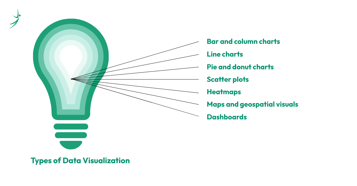
- Bar and column charts: Best for comparing values across categories, like sales by product or revenue by region.
- Line charts: Best for showing trends over time, such as monthly revenue or website traffic across a year.
- Pie and donut charts: Best for showing proportions of a whole, though they lose clarity quickly once there are more than four or five categories.
- Scatter plots: Best for showing the relationship between two numeric variables, commonly used in statistical and machine learning work.
- Heatmaps: Best for showing intensity or concentration across two dimensions, such as website click activity or correlation matrices.
- Maps and geospatial visuals: Best for showing data tied to location, such as regional sales performance across Nepal's province
- Dashboards: A combination of multiple chart types on a single screen, built to give a complete, real-time view of business performance.
What is KPI in Data Visualization?
Anyone learning data visualization will run into the term KPI almost immediately, so it is worth answering directly: what is KPI in data visualization?
A KPI, or Key Performance Indicator, is a specific, measurable metric that an organization tracks to evaluate whether it is meeting an important business goal. In data visualization, KPIs are usually displayed as prominent, easy-to-read numbers or small charts at the top of a dashboard, things like monthly revenue, customer churn rate, website conversion rate, or average order value.
The role of visualization here is to make a KPI instantly readable. A well-designed KPI card on a dashboard does not just show the number; it usually shows whether that number is up or down compared to a previous period, often using color, arrows, or simple trend lines, so a manager can understand performance at a glance without digging through a full report.
Data Visualization Tools: The Complete List
This is the part most beginners are actually here for: which data visualization tools and data visualization software do professionals actually use? Here is a breakdown of the major categories.
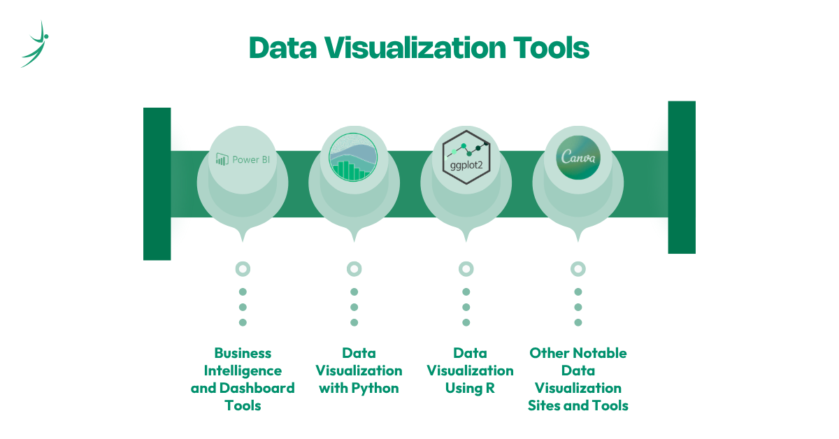
Business Intelligence and Dashboard Tools
- Microsoft Power BI: The most widely deployed BI and data visualization tool in Nepal's corporate sector, known for deep Microsoft 365 integration, drag-and-drop dashboard building, and the DAX formula language for custom calculations. Data visualization using Power BI is one of the most in-demand skills in Nepal's local job market right now.
- Tableau: Known for advanced visual storytelling, a highly flexible drag-and-drop interface, and strong handling of large, complex datasets. Data visualization using Tableau is heavily favored for global remote roles and analytics-focused positions.
- Google Looker Studio: A free, cloud-native tool that connects directly to Google Analytics, Google Sheets, and BigQuery, making it one of the most accessible data visualization free options for beginners.
- Qlik Sense, ThoughtSpot, and Zoho Analytics: Increasingly AI-driven data visualization tools that let users ask questions in plain English and receive instant visual answers, part of a broader 2026 shift toward augmented analytics across the industry.
Data Visualization with Python
Data visualization with Python is the standard approach for analysts and data scientists who need more flexibility and customization than a drag-and-drop BI tool allows. The core Python data visualization libraries include:
- Matplotlib: The foundational Python library for static, publication-quality charts; most beginners learn this first.
- Seaborn: Built on top of Matplotlib, simplifies statistical visualizations and produces cleaner, more polished charts with less code.
- Plotly: Built for interactive, web-friendly charts and dashboards, widely used when visuals need to be embedded into applications.
- Bokeh: Strong for interactive, real-time data visualization and large dataset performance.
Python is generally the preferred choice when a project requires automation, integration with machine learning pipelines, or highly customized visuals that a standard BI tool cannot produce out of the box.
Data Visualization Using R
Data visualization using R remains a strong choice in academic research, statistics-heavy roles, and certain financial analytics positions. R's ggplot2 library is widely regarded as one of the most powerful tools for statistical visualization, built specifically around a structured, layered approach to building charts. For most beginners in Nepal targeting business or remote data analytics roles, Python is generally the more practical starting point, but R remains valuable for analysts moving into more statistics-heavy or research-oriented work.
Other Notable Data Visualization Sites and Tools
- Canva: Increasingly used for designing visually polished, shareable infographics from data, especially for marketing and executive communication.
- D3.js: A JavaScript library used by developers who need fully custom, web-based, interactive visualizations.
- Excel and Google Sheets: Still the most universally used data visualization tools across every industry for quick charts, pivot tables, and straightforward business reporting.
Data Visualization in Data Science and Machine Learning
Data visualization techniques in data science go beyond simply building a dashboard for a manager to read. Data visualization in machine learning plays a critical, technical role at multiple points in a project:
- Exploratory data analysis (EDA): before building any model, data scientists visualize distributions, correlations, and outliers to understand what they are working with.
- Feature relationships: scatter plots and correlation heatmaps help identify which variables actually influence the outcome a model is trying to predict.
- Model evaluation: confusion matrices, ROC curves, and residual plots are all visualization techniques used to assess how well a model is performing.
- Communicating model results: even a highly accurate machine learning model needs a clear visual to explain its predictions to non-technical stakeholders.
This is one of the clearest points where data visualization tools in data science overlap directly with the broader data analytics toolkit, since Python libraries like Matplotlib and Seaborn are used identically across both descriptive analytics dashboards and machine learning workflows.
Data Visualization Best Practices and Design Principles
Knowing the tools is only half the skill. Strong data visualization design follows a consistent set of best practices that separate genuinely useful charts from confusing or misleading ones.
- Choose the right chart type for the data, rather than defaulting to whatever chart looks visually interesting; a line chart for a single category comparison is usually the wrong choice, for example.
- Avoid chart clutter, including unnecessary 3D effects, excessive colors, or too many data series crammed onto one chart. Use color with intention, reserving bright or contrasting colors to highlight the specific data point that matters most, not decorating the entire chart equally.
- Label clearly, since an unlabeled axis or missing legend turns even a well-designed chart into a guessing game for the viewer.
- Maintain consistent scales, especially on bar charts, where a truncated y-axis can make a small difference look dramatically larger than it actually is.
- Design for the audience, since a dashboard built for a technical analyst can include more density and detail than one built for a busy executive who needs the answer in five seconds.
These data visualization methods are not just aesthetic preferences. Poor design choices, intentional or not, are one of the most common ways data gets misrepresented and decisions get made on a wrong impression of what the numbers actually show.
AI and the Future of Data Visualization
Data visualization AI tools are becoming a standard part of the modern analytics stack. As of 2026, most major platforms, including Power BI, Tableau, and Qlik, now include AI-powered features like natural-language querying, where a user can type or ask a plain-English question and receive an instant chart in response, along with automated anomaly detection that flags unusual patterns without a human needing to go looking for them.
This shift does not eliminate the need for skilled analysts. Instead, it raises the bar on what is expected of them. Professionals who understand the underlying data visualization fundamentals, including which chart type fits which question and how to avoid misleading design, are far better positioned to evaluate and refine what an AI tool generates than someone relying on the AI output blindly. The data visualization specialist of 2026 is someone who pairs strong design judgment with fluency in these AI-assisted tools, not someone who has been replaced by them.
Data Visualization Career Paths and Salary in Nepal
Data visualization rarely exists as a completely standalone job title. Instead, it is a core skill embedded inside several closely related data analytics roles:
- Data Analyst: Uses data visualization tools daily to build dashboards, reports, and stakeholder presentations as part of the broader data analytics process.
- Business Intelligence Analyst: Focuses specifically on dashboard and reporting infrastructure using tools like Power BI and Tableau.
- Data Visualization Specialist: A more specialized role focused heavily on dashboard design, data storytelling, and visual communication, more common in larger organizations and international remote roles.
- Data Scientist: Uses visualization throughout the modeling process, from exploratory analysis to communicating final results.
Because data visualization is treated as a core skill rather than a separate job category in most of Nepal's job market, data visualization salary expectations generally align closely with the broader data analytics salary in Nepal:
- Entry-level data analytics roles, where visualization is a core daily skill, typically pay NPR 30,000 to NPR 55,000 per month.
- Mid-level professionals with strong dashboard-building experience in tools like Power BI or Tableau generally earn NPR 70,000 to NPR 1,30,000 per month.
- Senior data analytics specialists and visualization leads, often responsible for dashboard strategy across multiple departments, can reach NPR 1,30,000 to NPR 3,00,000 or more per month.
- Remote data analytics jobs with international clients consistently pay above these local figures, particularly for analysts strong in both Python-based visualization and BI tools like Power BI or Tableau.
How to Start Learning Data Visualization: A Roadmap
If you are ready to move from understanding data visualization to actually building it, here is a practical data visualization roadmap to
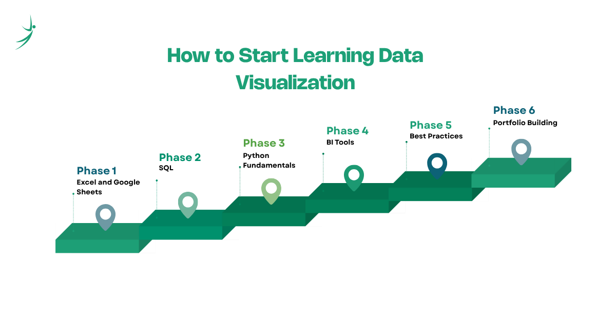
- Start with Excel and Google Sheets to understand basic charting concepts before touching any specialized software.
- Learn SQL so you can pull and prepare the data that eventually feeds into any visualization.
- Pick up Python fundamentals, especially pandas for data handling, then move into Matplotlib and Seaborn for your first real charts.
- Learn one BI tool deeply, starting with Power BI given its dominance in Nepal's local job market, then Tableau if you are targeting international remote roles.
- Study data visualization best practices directly, not just tool mechanics, since knowing which chart to use matters more than knowing every button in the software.
- Build a portfolio of real dashboards using public datasets, documenting the specific business question each visualization answers.
This roadmap mirrors the broader data analytics roadmap that most structured data analytics courses in Nepal are built around, since visualization is rarely taught or learned in isolation from the surrounding fundamentals like SQL and Python.
Where to Learn: Data Visualization and Data Analytics Courses
There is no shortage of ways to start. Free introductory resources, including data visualization free tutorials and data analytics free courses on platforms like Coursera and Kaggle, are genuinely useful for testing your interest before committing further time and money. A growing number of data visualization course online options also let you learn at your own pace from home.
However, self-paced learning consistently hits a wall once real, messy datasets are involved, which is exactly where structured programs make a measurable difference. If you are searching for a data analytics course near me in Nepal, or comparing a business analytics course in Nepal against a more general data analytics full course, look for programs that combine visualization tools like Power BI and Python with the surrounding fundamentals, SQL, statistics, and a real data analytics project, rather than a course that teaches one isolated tool.
A reputable data analytics institute or training provider should also offer practical pathways like a data analytics intern placement or mentorship-backed career support, since a portfolio of real, documented dashboard projects is what actually convinces employers, far more than a certificate alone. For learners comparing options, the difference between a data analytics best courses listicle and an actual results-driven data analytics specialist program usually comes down to how much hands-on project work and instructor feedback is built into the curriculum.
Conclusion
Data visualization is the layer of data analytics that turns analysis into action. Whether it is a simple bar chart in Excel, an interactive dashboard built in Power BI, or a custom Python visualization feeding into a machine learning workflow, the underlying goal never changes: making data easy enough to understand that the right decision becomes obvious.
For anyone exploring data analytics as a business or a career in Nepal, data visualization is one of the fastest skills to start building real, demonstrable value with, and one of the most consistently requested skills across data analytics jobs, both locally and remote. If you are ready to move from reading about data visualization to actually building dashboards with real data, explore the Business Data Analytics with AI Course at Skill Shikshya, where you will work hands-on with Power BI, SQL, and Python under the guidance of instructors with real industry experience.
Frequently Asked Questions
What is data visualization in simple terms?
What is data visualization used for?
What is KPI in data visualization?
Which data visualization tool should I learn first?
Is data visualization part of data analytics or data science?
What is the salary for data visualization or data analytics roles in Nepal?
Are there free ways to learn data visualization?
Do I need to know coding for data visualization?
About Author:

Mr. Saurav Raj Joshi is a skilled Data and BI Engineer at Fusemachines, specializing in SQL and the Azure ecosystem, including Fabric, Azure Data Factory, and Synapse Analytics. He focuses on building efficient ETL pipelines, upgrading legacy systems, and ensuring data integrity to support informed business decisions.
Mr. Joshi is also adept at translating complex technical concepts into clear insights and creating effective data visualizations that drive operational efficiency and business growth.